Friday, April 27, 2012

welcome to my home!

My Home Series.....
Come on in...make yourself cozy.....grab a seat.  This is the entry to our house built in 1905.  It was moved and updated in 1991, so it has some features that are not original and not as great as the original would have been, but the builder was a restorer of old homes and tried to keep it in the same Victorian style.  Since moving in, we have done a little updating ourselves to make it just a little more contemporary and ours.  Here we are - a shot taken from inside the front door.

As mentioned before, we painted the walls white from a yellow and more recently also the trim to a true white (Behr -"Frost") from a very very off-white, then all the doors Black (Behr -"Beluga").  I put in this cordless white roller mess sunshade and think it looks nice and simple.  The light fixture was a more recent purchase and I bought on Etsy from Jean Pelle.  The long hand-made bench was a find from Sacramento, from the antique mart, where I found lots of unrecognized gems.  I chalked up the finds in old Sactown to not a high demand for style, so the prices seemed fantastic after living in NY and I had great luck there (one of the few perks). The rug was a hand-me-down from my every-so-stylish mamacita.  She has a lot of great rugs, which we will have to showcase later in a post. Nice to be the child of a mom with taste!
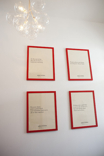
These posters I bought at the Renegade Craft Fair and were printed by a creative group that offices together and calls themselves "Public School" in Austin.  I framed them in red, thinking I wanted some color in the entry, as well as a contemporary juxtaposition to the Victorian details.  Simple.

photos taken by Sarah Wilson

Monday, April 23, 2012

k k k kitchen please

 Since I hate our kitchen and really wish that I could just tear the counters off with my bare hands, I do like to look at photos of kitchens to get dreamy ideas of what I might do someday.....This collection is mostly white.  I waiver between loving the wood counter tops and the stainless steel. 
photo via designspirationsk
                                                               photo via thedecorista
                                                      photo via designspirationsk.com
                                                        photo via designspirationsk

More posts this week!  Have lots to show you of things I like!

Friday, April 13, 2012

moroccan delight

photo via kismettile.com

This company I discovered one day during my trolling of the internet for resources and ideas, Kismet Tile is just amazing, if you ask me.  Tracy Reinberg is the owner and designer.  You can choose to do something like what she has in a large catalog of designs or she will also work with you to do something custom (for a bit higher price).  I initially was attracted to Kismet when I saw this kitchen pictured above somewhere and I love the blue and grey combo.  Also love the matte grey cabinets and molding.  I snagged a couple of the other patterns that I like from Kismet's site to show you some other ideas.  Kismet Tile can be used for floors or walls, indoor and some outdoor applications, residential and commercial installations.


Thursday, April 5, 2012

piping hot

I have been seeing and really liking the use of pipes as installations for DIY projects you can do to hip up your house.  There are so many ways to use them and get the industrial feeling and depending on the pipes you choose you can control the look you are going for.

I saw this on Weekday Carnival.  It reminds me of the lofts in New York (one that I used to live in) that has the exposed piping and white walls.  Here she made a lamp, but also the piping can be used for a rack or place to hang things.  Maybe for a bathroom this would be great and could double as a towel rack?
photo via the-brick-house

My last trip to LA a couple of weeks ago, I visited my friend's house.  Her husband Jerome built and designed it as model for his company, Sunia Homes (more to come on this later).  They used piping instead of closets in the bedrooms.  I loved the black pipes he selected and the fact that Jamie and Jerome's closet spaces looked perfectly edited from Vogue.

Monday, April 2, 2012

rope and wood

I call this the harp chair.  It is just so beautiful and interesting, though I'm not sure how functional it would end up being in your home, but a great art piece for design purposes.

mid-century pasadena

My friend's house in Pasadena....you know who you are.  Took this a long time ago, because I love the classic mid-century lines and especially how this amazing cactus is built into the house.

a new beginning

Thanks to the talented photographer Sarah Wilson, I did my first photo shoot of interiors.  We took some photos of my house to use for marketing and commercial purposes for Purveyor - the name that I am currently using for my design and decorating business.

I wish I had known that I would be doing this when we first bought the house 2 1/2 years ago, so that I had "before" photos.  But, I can tell you that everything was yellow!  Every wall, ceiling, and even the trim was a yellowed off white.  So, we painted everything, well except for this room -WHITE!  I also had the inside of the window frames and many of the doors painted black in the winter.  I love the effect that it gives.  It brings out the details in the old house, but also gives it modern take on an old idea.  You will see the repetition of black and white throughout the house as the blog goes on.  Welcome!

DIYs - Painted the original old light fixture with school bus yellow glossy spray paint
         - covered the chair seats myself with Ikea cotton fabric